Web Design


Final Web Design Submission
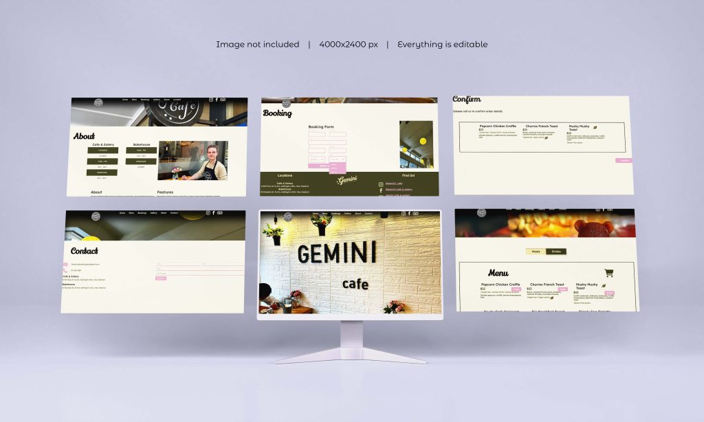
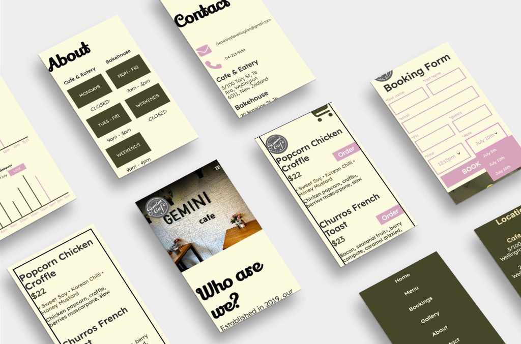
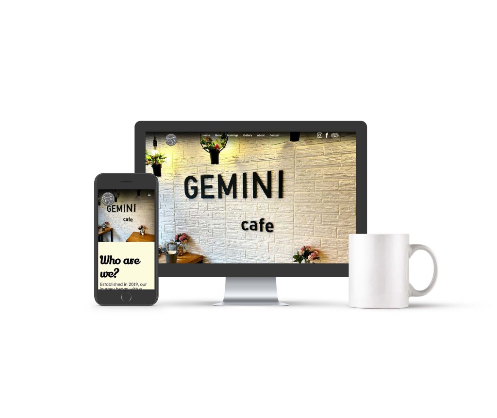
What you’re looking at here is my final web design submission at Yoobee Colleges. The brief of this assignment was to redesign Gemini Cafe’s current website to engage users, attract new customers, display important content/info such as the menu, cafe details, maps and so on but most importantly improve their current websites navigation for smoother user-flow. The client requested to keep their current in-store design style which can easily be described as instagramable, modern, trendy, sleek, clean etc. Both there stores have lots of greenery and pale, earthy tones so thats where the greens and muted tones come from. From further inspection both their restaurants have a cozy atmosphere so I chose colours/tones that represent coziness well. I designed my designed for millennial up to boomer target audiences so I had to consider the types of struggles these age groups face and why they’re using the gemini cafe website which brings me to the website purpose.
My websites purpose is to improve my clients (gemini cafe) current websites navigation so people will leave the website satisfied because they could find what they were searching for when they clicked on my website with ease. My website is to also engage people, whether it be legibility, accessibility and/or fit customer/user wants or needs.
For more insight, Gemini cafe is a Wellington, NZ based restaurant/cafe with two locations in Wellington central. One being a cafe & eatery and the other a bakehouse.


The Design
Process...
I started with idea generation, which usually involved brainstorming ideas. Then, I moved on to expanding these ideas into concepts/low-fidelities, which consisted of layouts. After completing these concepts/low-fidelities, I reached out to others to gain feedback. This feedback helped me understand how to improve these layouts into more carefully constructed layouts based on suggestions from others, which are called high-fidelities. With high-fidelities, both myself and others could visualize how color schemes, fonts, font sizes, and other visual attributes worked together to create a final design.
Next, I gathered more feedback from others to gather additional opinions and critiques. Finally, I completed the final design using people’s feedback. Once the final design was completed, I carried out user testing. For this assignment, I asked people within my target audience age range to provide accurate responses on how they reacted to my design and navigation. I created a list of questions for each age range, which users followed as tasks. They also had to answer questions correctly to ensure they successfully navigated my website. In simpler terms, it confirmed that my website’s navigation was intuitive, which was the goal.